Layout
All pages are designed with a 10px grid and 4 columns and fit with them. This layout grid will offer consistency, efficiency and visual clarity that contribute to a cohesive and visually appealing user experience
Containers
There are 2 main layout structures in our app.
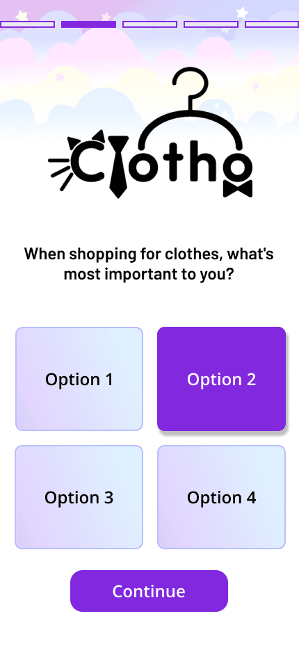
The first one is composed of 4 block sections. It is designed to guide users through a sequential process. The quiz page as an example, is made by the progress indicator, logo, questions and answers, and navigation button.
The second layout is made up of 3 block sections. It can be found on the onboarding tutorials, inventory page, thrift store page and so on. It is designed with the top, middle and bottom parts to ensure a clear visual hierarchy to guide users' attention effectively.
Quiz Page Layout
Onboarding Page Layout


- 10px Grid & 4 columns
- Layout: Progress indicator, Logo, Questions & Answers and Navigation Button.
- Consistency: Using a grid system helps maintain consistency across different pages of the app.
- Efficiency: Easily divide the screen space into equal or proportional sections.
- Visual Clarity: Provides clear guidelines for element placement, alignment, and spacing, enhancing readability and reducing visual clutter.
- 10px Grid & 4 columns
- Layout: Contents/top chips, images/cards and navigation buttons/bars
- Top Section: Positioned at the top of the page, it contains the logo, title and some quick access buttons.
- Middle Section: Taking up the majority of the page's space, this section occupies the central area. It includes all functionalities and contents for users to interact.
- Bottom Section: Located at the bottom of the page, may include additional tips, suggestions, or navigation options for users to explore further.